How To Master The Art of Data Visualization (and Get Better Marketing Insights)

Data visualization is a buzzword in the world of digital marketing that sparks questions like: How do I turn my data points into insightful visualizations? Am I reporting on too much data? Where should I start?
Set the Stage: Wireframing
Wireframing sounds technical, but it’s really just an efficient way to start organizing your ideas, whether you’re using an online wireframing tool or just a piece of scratch paper, before committing to a design in your final product. You’ll be able to adjust and improve your design and incorporate feedback from stakeholders while avoiding reworking later in the game, which is much more time-consuming.
First, focus on a high-level view of your visuals, then identify what questions you are trying to answer with the data and think about how the customer journey should flow. You’re constructing the story you want to tell with your data, not sweating the small stuff here. The details will be ironed out in the subsequent next steps. Once you’ve refined the wireframe, you’ll have a blueprint to bring your visualizations to life.
Identify the Right Data Visualization
Now that you know the story you want to tell, you need to add some style: you need to choose the right data visualization that will effectively communicate and illustrate that story to your intended audience, as well as help them draw the right conclusions from your data.
The biggest factor in determining the best visual for your needs is the type of data you’re working with. There are many different kinds of charts out there to choose from, but we recommend starting simple and considering the following three:
Bar Graph
Best for: Comparing data points across categories
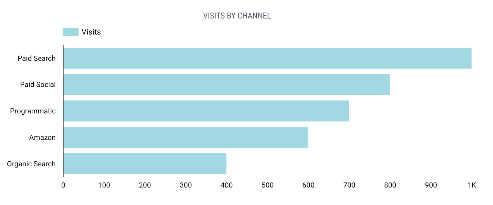
A bar graph presents categorical data with rectangular bars. We can count the values of various categories using bar graphs. The length or height of bars is proportional to the count of the category and lets your audience easily understand relative performance across your chosen categories.
Trend Line
Best for: Illustrating performance over time
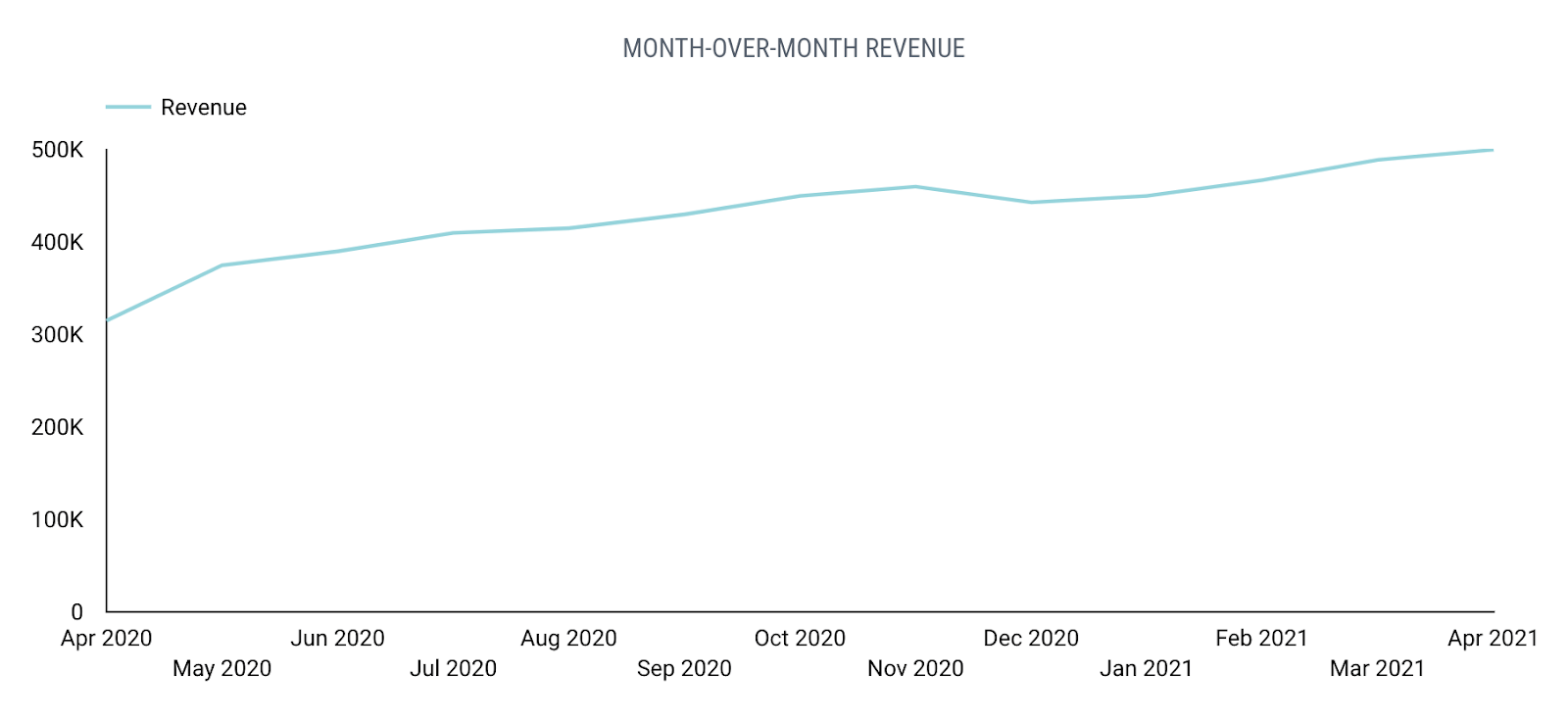
We use line charts to visualize data that changes over time. It works with continuous data and represents a series of data points connected by a straight line. Line charts help people quickly and easily understand changes and trends, as well as seasonality and other factors.
Funnel
Best for: Visualizing sequential steps
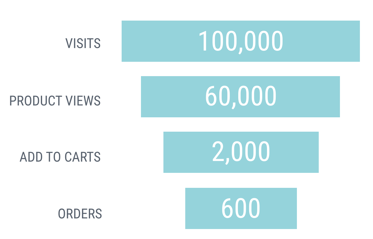
A funnel chart is a specialized chart type that demonstrates the flow of users through a business or sales process. The chart takes its name from its shape, which starts from a broad head and ends in a narrow neck. The number of users at each stage of the process are indicated from the funnel’s width as it narrows. The funnel is a great visualization for understanding the effectiveness of processes that have multiple steps like the customer journey.
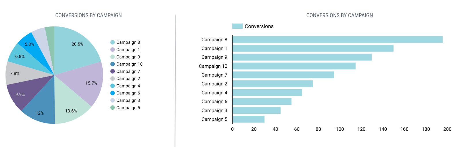
One note: pie charts are one of the most commonly used chart types, but they’re actually hotly debated in the world of data experts. As Cole Nussbaumer Knaflic explains in her book, Storytelling With Data: A Data Visualization Guide for Business Professionals, pie charts are often not the best way to visualize data because they make it difficult to compare data points, especially if the size of the wedges are too similar. Our data teams agree, so save the pie for dessert and consider alternatives to the pie chart, like a horizontal bar graph where all of your data points are aligned on a single, shared axis.
Once you’ve selected the right type of chart, it’s time to refine that chart by diving into the details. By focusing on simplicity and using color thoughtfully, you can turn your good visualization into a great one.
Keep Your Data Visualization Clean & Simple
One thing a lot of people get wrong about data visualization is the assumption that quantity and complexity are somehow more useful or more impressive. The opposite actually tends to be true: if there are too many data points or design elements, it can be difficult to know where to focus.
You don’t want all of your hard work to go to waste because you can’t use it to generate actionable insights. If you find yourself with an unwieldy, overcomplicated visualization, don’t panic: it’s not too late!. Take a step back and follow these two steps:
- Audit your displayed KPIs
- Consider which KPIs are really necessary in your visualization. The right KPIs will depend on your business model, the flow of the customer journey, and your audience.
Once you have narrowed down your most important KPIs, feature them in your visualizations. Any additional metrics can be saved for the appendix.
- Consider which KPIs are really necessary in your visualization. The right KPIs will depend on your business model, the flow of the customer journey, and your audience.
- Simplify your design
- People often think that more design elements = better visualizations, but that’s fiction, pure and simple. In Effective Data Storytelling: How to Drive Change with Data, Narrative and Visuals, Brent Dykes notes examples of unneeded features in graphs including 3D elements, pronounced grid lines, and too many labels and colors.
- Incorporating too many design features can be distracting to the user and shift focus away from the KPIs that are telling your story (and matter to the audience). Instead, you should focus on adding valuable chart elements such as descriptive titles, labeled axes, and relevant data labels that make the story more accessible. Lastly, be careful of line graphs with multiple lines and colors. They’re often difficult to read and glean insights from.
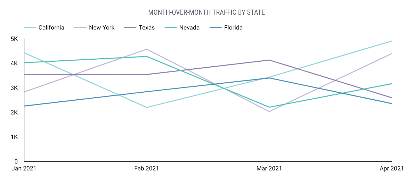
In the above example, the line graph is comparing traffic across various regions. But we actually recommend breaking out each region into its own graph so trends can be more easily compared.
Now that you have narrowed down your most valuable KPIs and simplified your design, it’s time to strategically incorporate color.
Choose Colors Thoughtfully
Too much color in a visualization can detract from the data and make it difficult to garner insights. When color is used, it should be incorporated thoughtfully and minimally.
Color can be used to create associations, highlight differences, and show relationships. When a specific color is assigned to a specific data point, that color becomes a key. When that combination is repeated consistently, you can train the user to recognize that your chosen color is related to a specific data point. For example, in the stacked bar graph image below, if Paid Search is consistently visualized in an orange color, the user will be able to quickly and consistently identify orange in any type of visualization as Paid Search.
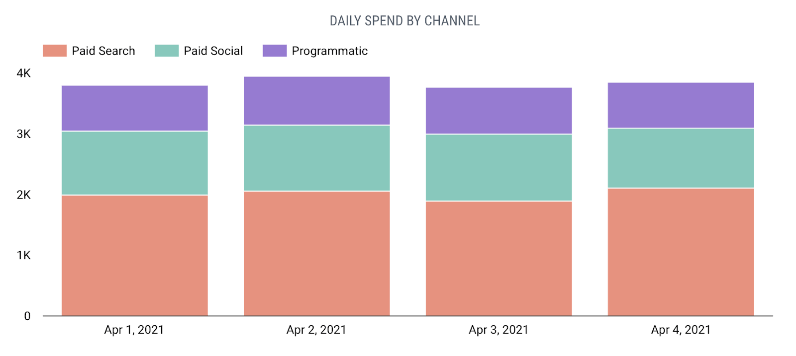
Notice that varied colors are also used to easily distinguish each channel within the graph.
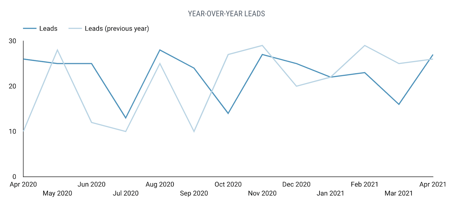
Similar colors can be used when you want to make it clear that two data points are related. One example (shown below) is a line graph visualizing X brand’s current performance in a dark blue color and a second comparative line with last year’s performance in a light blue color:
We tend to associate red with negative results, so stay away from using red as the main color in your graphs. Instead use it sparingly to illustrate decreases in performance.
When selecting colors to use in your charts, also take into consideration that 4% of the population is color blind. According to The Journal of the Data Visualization Society, the most common forms of color blindness cause confusion between certain shades of red and green, though there are also forms of color blindness that cause blue and yellow shades to look the same.
Simply put, color is an important asset in charts, so it should be used in a strategic and thoughtful way.
Simplify Your Data Reporting Process
A simplified data visualization process sets your business up for more meaningful reporting that makes an impact and (hopefully!) makes you feel more confident when building reports and sharing results. To quickly recap:
- Start by wireframing your ideas, so that you can easily revise and refine.
- Determine the best chart type for the data at hand. Narrow down your displayed KPIs to only the most important and simplify your chart design so that the data remains the focus.
- Use color thoughtfully to act as a key or show relationships in the data, and keep color blindness in mind when selecting a color palette.
A reporting facelift can make a big difference in your business by unlocking insights across your organization and making your performance data more accessible to stakeholders.


Responses